Design Systems Must Be Flexible and Scalable
I learned that a design system should never be “final” and they must adapt as the product evolves. Creating structures that allow variants to grow, swap, and extend ensures the system remains relevant.
Restandardised StoreHub’s design foundations by converting fragmented, outdated design files into organised, reusable component libraries across multiple platforms, streamlinining the design workflow for future product development.
Product Design Intern
1 week
Figma, StoreHub Beep Delivery
The consolidation led to clearer visual standards and a more efficient workflow for the design team :
Over the years, StoreHub’s Product Design team went through many transitions. As designers joined and left, documentation practices became inconsistent and design files evolved without a clear source of truth. Gradually, the organisation accumulated fragmented legacy libraries, duplicated components, and outdated UI patterns.
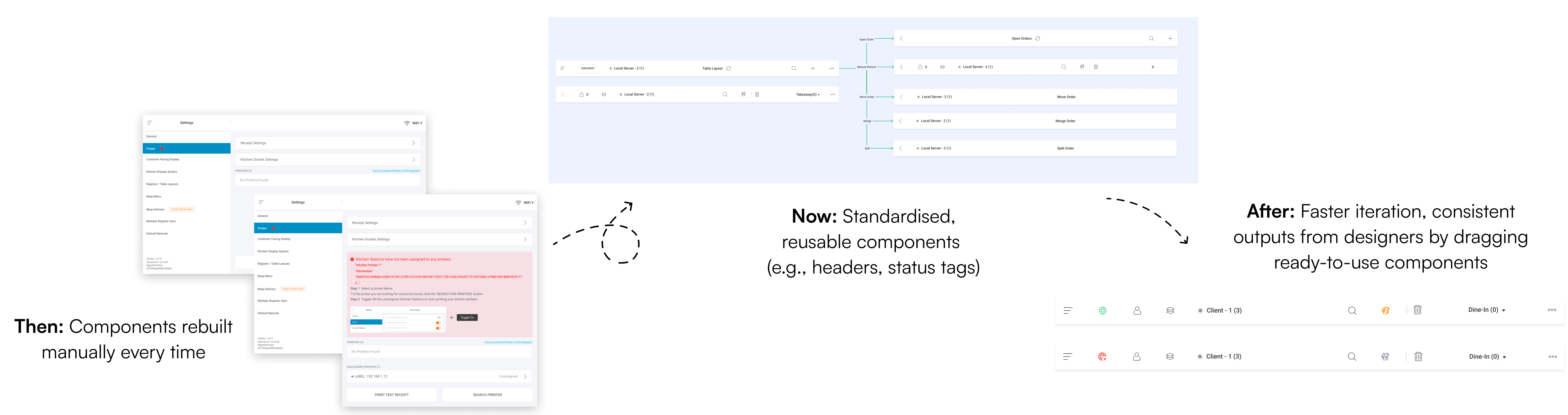
Without a standardised foundation, designers frequently had to rebuild the same components from scratch, sometimes repeatedly for identical use cases, resulting in slow and error-prone workflows.
A typical design task spanned 1-2 weeks, from design exploration to grooming with engineers. But in reality, the actual hands-on design time was limited once meetings, alignment sessions, and reviews were accounted for.
Without reusable components:
A unified component library was no longer a “nice to have”, instead it became essential infrastructure for delivering fast and scalable product work.
A full audit was conducted across all legacy Figma files to understand the depth of design debt and inform what needed to be rebuilt.
The audit revealed major workflow bottlenecks that often go unnoticed. Designers spent more time searching for components than designing due to recreating UI from scratch was often faster than locating existing components.

Based on the audit, several areas were identified as critical for cleanup and reconstruction in a centralised Figma file, forming the foundation of the design system framework:

Rebuilding the design system was far more than a simple clean-up exercise. It required identifying UI patterns and reconstructing components with long-term scalability in mind.
To ensure the system could grow with future product changes, I followed a bottom-up rebuild strategy:
This approach allowed that every element in the system was stable and ready for future product evolution.
Under this section, I defined how the entire system is structured (from the atomic level to complete user flows), clarifying how components are built, how screens are standardised, and how designers apply the system consistently across platforms.
1. Component Architecture
Using an atomic design approach, I rebuilt the system starting from core primitives (text styles, colours, icons) and progressively structured them into molecules, organisms, and full templates.
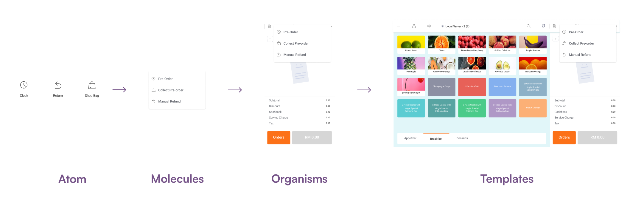
Each component was redesigned with clear variants and usage logic so designers could assemble screens faster while reusing patterns consistently across platforms. This architecture certainly forms the backbone of the new design system as it ensures scalability, efficient reuse, and predictable behaviour across StoreHub’s products.
2. Screen Standards
StoreHub products operate across multiple environments, such as mobile applications, tablets in restaurants, and desktop BackOffice tools. To ensure responsiveness behaviour across all interfaces, we standardised three primary screen sizes:
We adopted a mobile-first approach to maximise scalability. By starting from the smallest breakpoint, components could expand logically across tablet and desktop layouts without redesigning each element from scratch.
3. Documentation Guidelines
Alongside rebuilding the design system, I created documentation for each component with clear anatomy breakdowns, usage rules, variants, and actual implementation examples.

This reduced ambiguity during design and handoff, allowing designers and engineers to work with consistent patterns and predictable behaviour across platforms
The rebuilt design system delivered measurable improvements across StoreHub’s product design workflow. With clearer documentation, including component anatomy, usage rules, and behaviour guidelines, we achieved improved scalability and higher design-engineering alignment.
Overall, the consolidated library restored structure, clarity, and efficiency to the entire workflow, transforming the previous design bottleneck into an accelerant for faster product development.
I learned that a design system should never be “final” and they must adapt as the product evolves. Creating structures that allow variants to grow, swap, and extend ensures the system remains relevant.
I learned that a well-built component means nothing if the team does not know when or how to use it. Clear documentation ensures straightforward system adoption and prevents another design debt.
A unified design system ensures consistent visual language and supports smoother handovers between design, product, and engineering.