
Optimisation Matters
Designing flexible pathways to accommodate different user goals and reduce redundant steps by unifying similar flows.

Redesigned the official Urban Museum (UR-MU) website into a mobile application to modernise the visitor experience with information clarity and strengthen engagement with art content.
UI/UX Designer
(led Stage 3: Parallel Design, Participatory Design, Style Guide, and Prototype Rationale;
assisted in Stage 1 : User, Task, and Environment Analysis)
May - August 2025
Figma
Usability testing showed a 20% improvement in task efficiency and an 80% reduction user errors, which directly validates the effectiveness of the redesign.
Understanding the users, their goals, and the environment to inform a human-centered design. So to begin with the process, I conducted a couple of research activities.
We conducted a stakeholder analysis using Mendelow’s Matrix to identify and prioritise key stakeholders based on their power and level of interest in the redesign process.

Through this matrix, we identified that:
We conducted an online questionnaire and received responses from 32 participants without setting any pre-determined criteria to capture diverse user perspectives and behaviours.
The goals of this survey were to:
It was equally important to observe the real environment of the Urban Museum to identify contextual challenges and opportunities. This helped uncover how visitors interact with physical exhibits and where the redesigned UR-MU application could bridge existing gaps.
In order to conduct effective data collection within the designated timeslot, an observation checklist was prepared in advance.

Before redesigning the UR-MU Application, an evaluation of the existing website was conducted to identify usability challenges and inefficiencies within user journeys.
This analysis uncovered redundant steps and unclear navigation paths that impacted the overall visitor experience.
This analysis maps key user tasks to identify usability issues and inefficiencies in the current website.
Hierarchical Task Analysis 1 - Purchase a General Admission Ticket from the UR-MU website.
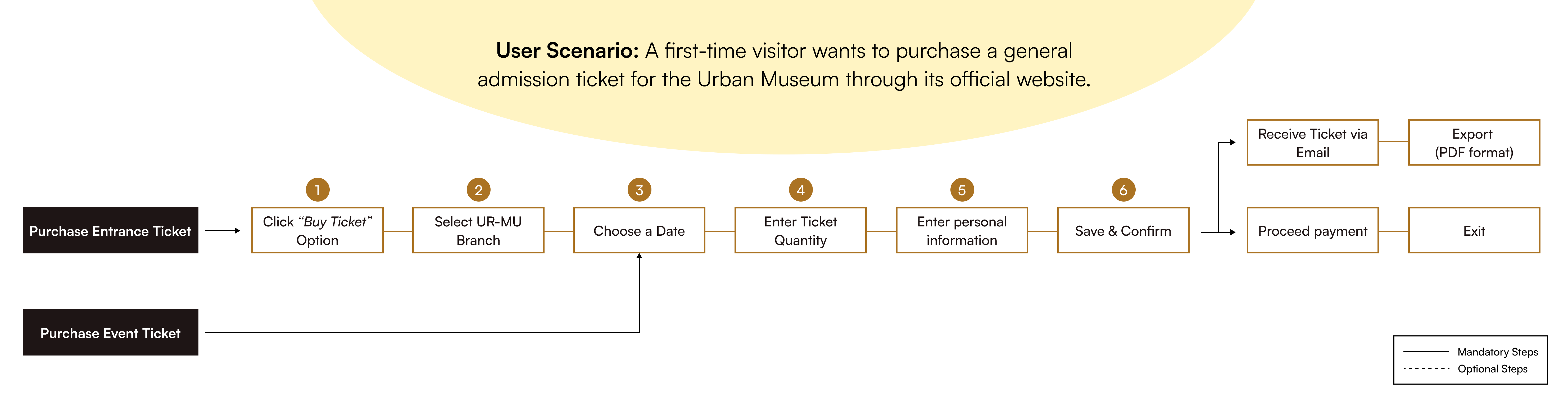
Pain points identified are:
Hierarchical Task Analysis 2 - View News and Events from the UR-MU website

Pain points identified are:
This phase marks the transition from research insights to tangible design exploration, focusing on two key activities:
(a) Parallel Design and (b) Participatory Design to establish a solid framework before progressing into high-fidelity prototyping.
In this stage, we explored multiple design concepts to identify the most effective solutions or combine the strengths of each into a unified design that best supports project objectives and user needs.
Three core screens were prioritised for exploration based on insights from preliminary research, each representing a key touchpoint in the visitor journey.

Following the parallel design stage, a participatory design session was conducted with 5-6 participants from key user segments of the UR-MU Application. The selected participants included: Gallery Visitors, Educational Institutions, Art Gallery Staff, and UX Experts.
Their feedback helped identify common patterns in content categorisation to ensure the final structure reflected both user logic and design consistency. Therefore, the information architecture has formed to define the navigational hierarchy and content structure of the UR-MU Application in a logical grouping

Building upon insights from the design ideation phase, the prototype phase focused on translating validated design concepts into an interactive high-fidelity experience.
This stage aimed to visualise the complete user journey of the UR-MU Application, serving as both a design validation tool and a communication medium to demonstrate how the proposed improvements could address the pain points identified in earlier stages.
A shared style guide ensured visual consistency and alignment across the team, allowing the UR-MU Application to maintain a cohesive and scalable design across all screens.

The final interface was translated into a fully interactive high-fidelity prototype. View in Figma to explore user flows, transitions, and key design decisions.

Usability testing was conducted to evaluate whether the redesigned UR-MU Application successfully met primary usability goals: Efficiency, Memorability, and Subjective Satisfaction. This phase aimed to validate how well users could complete key tasks while identifying areas for potential design refinement.
Participants were asked to complete the following tasks:
Every design outcome carries both strengths and opportunities for improvement. The usability testing of the UR-MU Application revealed strong task completion rates, along with valuable feedback highlighting areas that could be refined.
These insights reflect how users interacted with the redesigned interface in real scenarios, uncovering both positive experiences and pain points to guide future iterations.

Designing flexible pathways to accommodate different user goals and reduce redundant steps by unifying similar flows.
Allows design to support all users, including those affected by environmental constraints or physical limitations for an equitable experience.
Clear and descriptive button labels should be used to help communicate intent as users may interpret symbols differently.